VITTAL
CONNECTING PSYCHOLOGISTS AND PATIENTS IN TIMES OF SOCIAL DISTANCE
How might we connect and empower psychologists and patients in a simple way, while addressing the specific needs of each one?
The Challenge
Our project team set out to address two key challenges:
how might we help Brazilians living abroad take care of their mental health without feeling disconnected from home?
how might we support psychologists in managing and growing their businesses while they focus on providing psychological care?
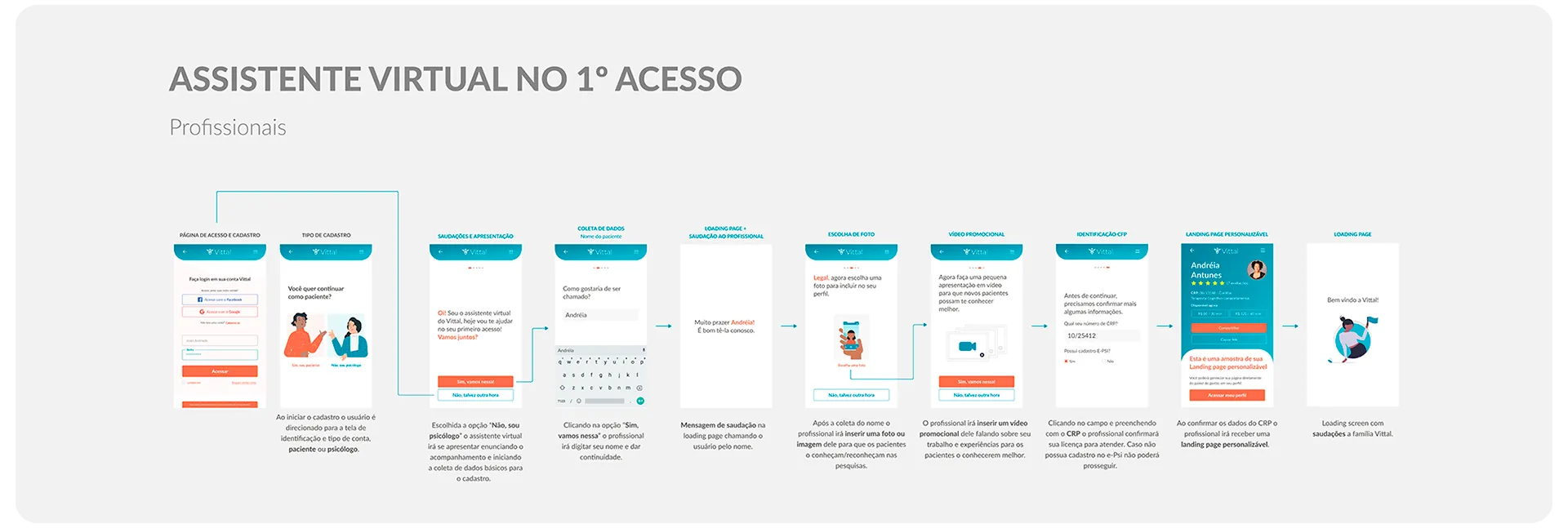
To tackle these challenges, we developed Vittal, a digital solution that connects Brazilian psychologists with clients living outside of Brazil. Our journey to create Vittal was divided into six key themes: The Current Landscape, The User Experience, Validation, The Challenge, The Solution, and Testing.
We knew that designing a platform to address the specific needs of Brazilians living abroad and their psychologists required a deep understanding of our users. Through extensive research, we gained insights into the challenges and needs of both groups, and used those insights to inform the design and development of Vittal.
We hope that Vittal will make it easier for Brazilians living abroad to access the mental healthcare they need and for psychologists to focus on providing quality care, no matter where they or their clients are located.
Current Scenario
Brazil
It’s not new that Health and Well-being are part of the United Nations Sustainable Development Goals. The topic of mental health has gained even more attention due to the global pandemic caused by COVID-19, placing it at the top of the priority list for most governments, especially due to the social isolation established by the majority of countries. This has accelerated the search for technologies that can help address the problem, such as virtual care or telemedicine.
However, offering virtual care has been an option for professionals and companies for some time, with many professionals adopting the practice since the resolution CFP nº 011/2018 came into effect in 2018, which made it possible to provide remote and real-time psychological counseling. The difference now is that this has gone from being an option to being the primary or only form of care.
As a result, psychologists and patients had to quickly adapt to maintain their treatments, using technologies that were already a part of their lives, such as WhatsApp and FaceTime, as well as introducing others like Zoom, Hangout, or Whereby, which were suggested by both parties.
According to a report by the Brazilian Ministry of Foreign Affairs, over 3 million Brazilians are living in other countries, considering all types of visas, such as for study, work, permanent residence, and citizenship, as these individuals do not lose their Brazilian citizenship. For our project, we decided to start with a more specific audience, which is Brazilian students living abroad, but not limiting our solution to this group.
Research and reports from people show that these Brazilians living abroad have been underserved by both the country they currently reside in and Brazil. This happens because governments are focused on solving internal problems and prioritizing their citizens, while foreigners do not fit into either scenario.
When we look at students, this number has reached 500,000 and has been growing year after year. And when it comes to mental health issues, this number among this group is growing proportionally.
Brazilians living abroad
Competition Analysis
In order to better understand what solutions our market competitors are already providing and identify opportunities for our own product, we conducted a thorough analysis of the leading competitors in our space. Our findings and analysis are presented below.
The Users
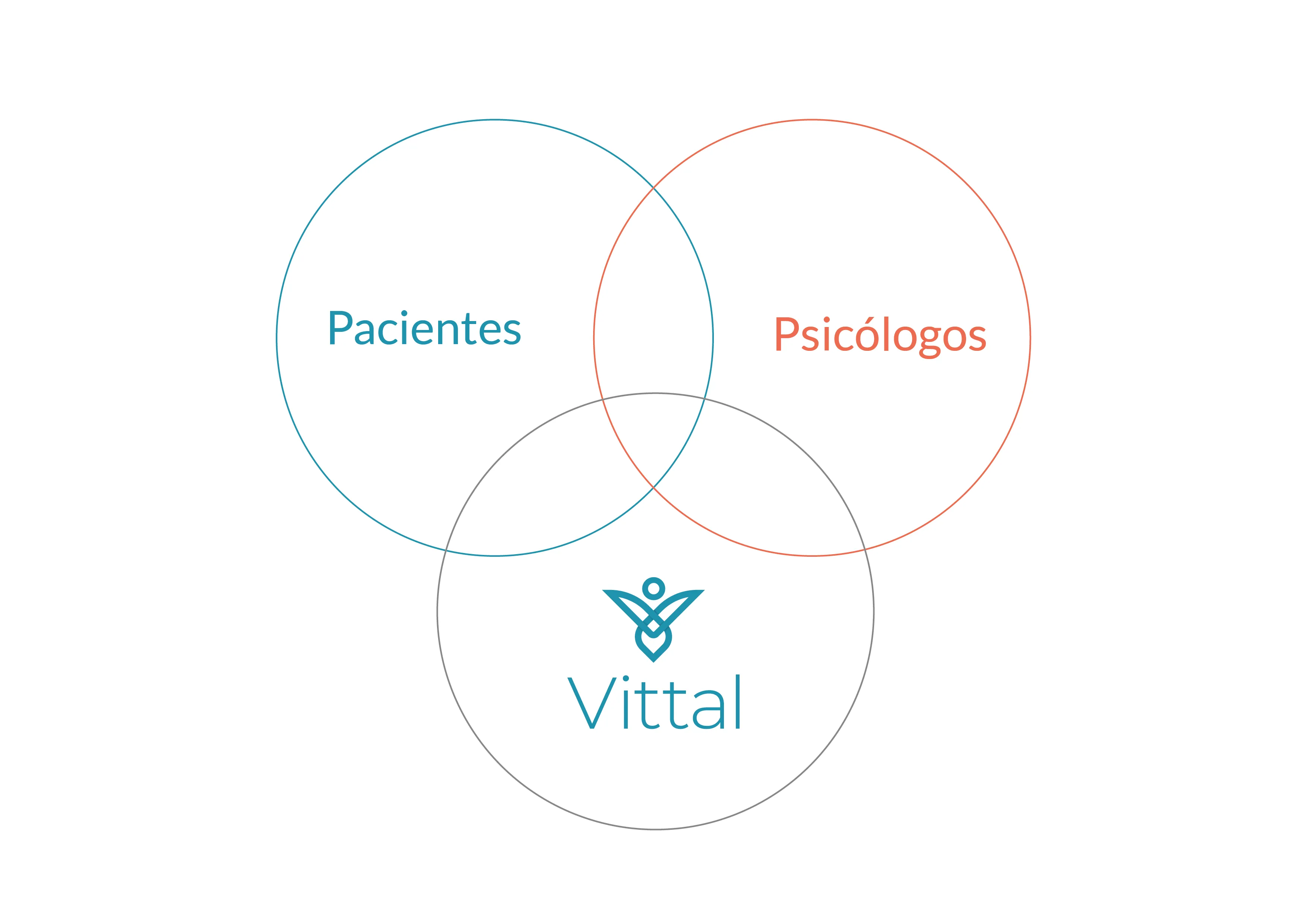
During the user definition process, we identified several personas, with a focus on Brazilian students living abroad and entrepreneurial psychologists. We chose to do so because we found a strong connection between their problems. We applied the IDEO concept to illustrate how we connect the patient’s needs (desirability), the psychologist’s needs and goals (viability), and our digital platform (feasibility), as illustrated in the figure below:
Next, you can learn in detail about our personas.
Personas
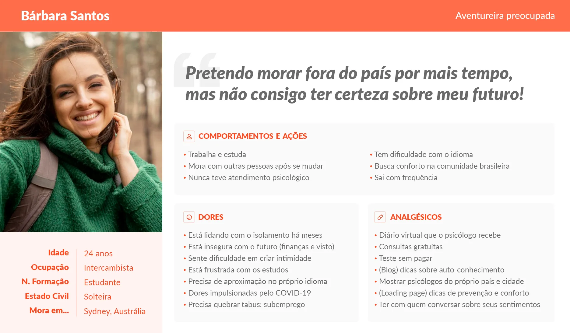
Students who live outside of Brazil and would like to feel closer to home and the community, especially when they need to talk about their feelings.
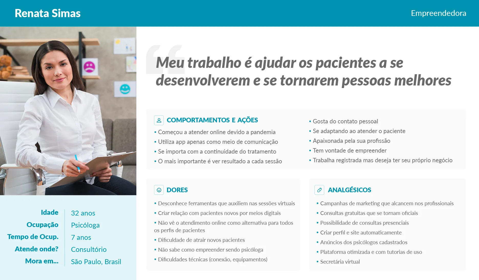
Psychologists who are looking to become entrepreneurs but were not trained for it, and as they are 100% focused on their patients, they end up putting the business in second place.
User Journey
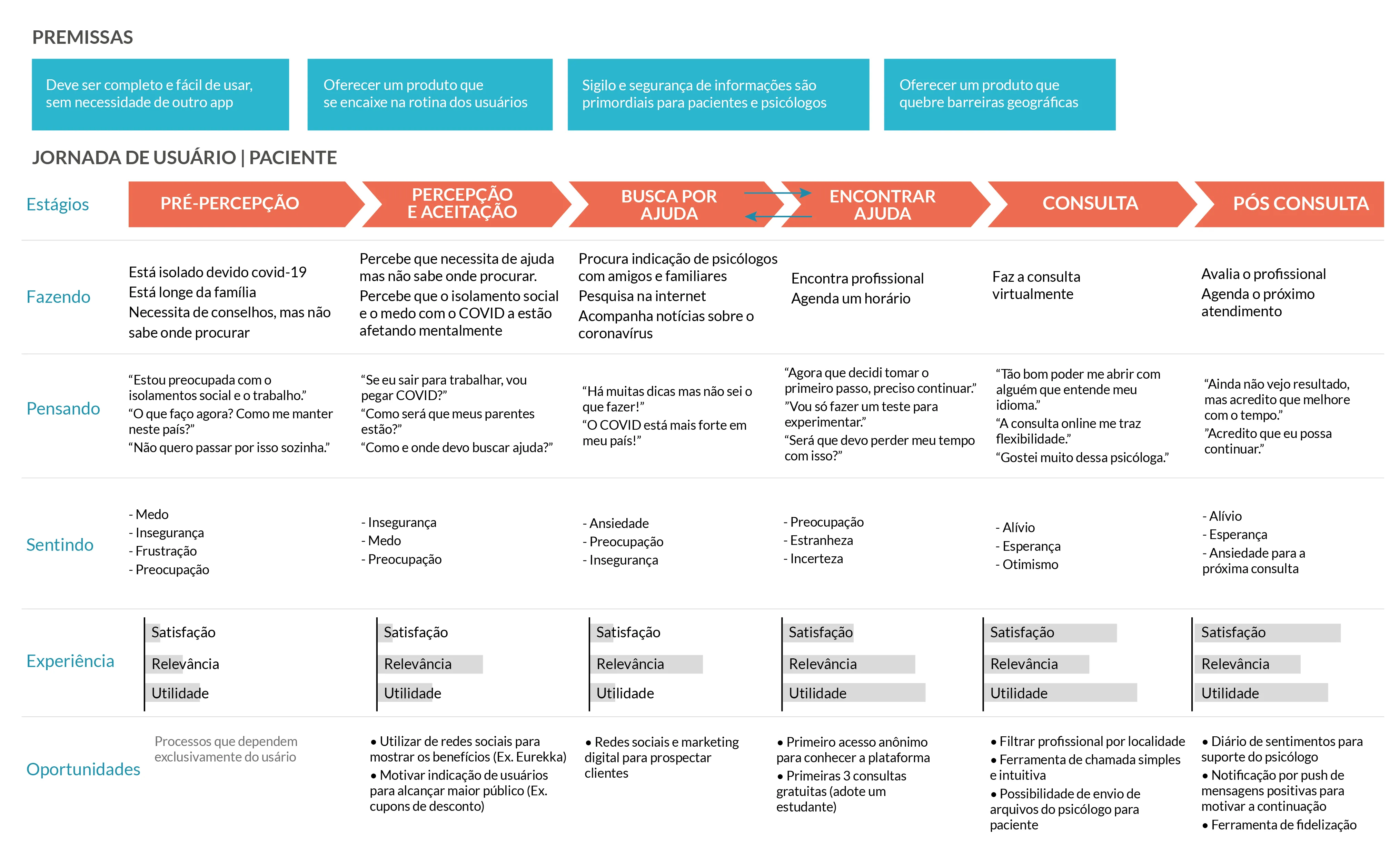
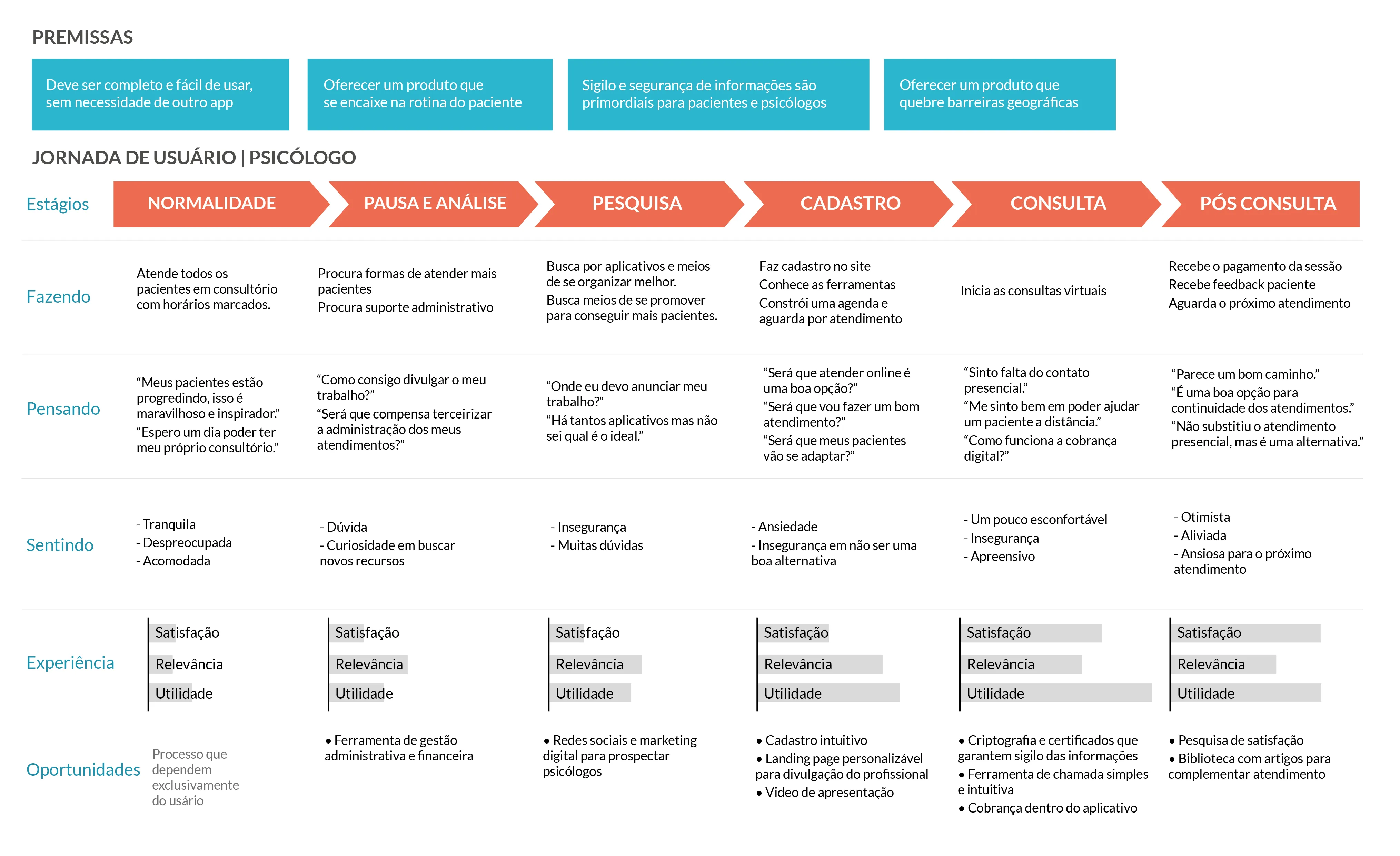
After defining the personas, we built a User Journey including stages of consideration, evaluation, purchase, and technology use. The analysis of competitors – already mentioned in this article – allowed us to “walk a mile in the users’ shoes”, experience each stage of the journey, and identify opportunities for our solution.
User Definition Through Pixar Storytelling
Patient
Once upon a time, there was Barbara, a 24-year-old student and exchange student in Sydney, Australia. She had never had online psychological consultations before.
Every day she works and studies, but she is having difficulty with English, the primary language in Australia. As she is attached to her family but now lives with people she did not know before, she misses home and due to the COVID-19 context, she is worried about her visa and her job, resulting in several concerns amplified by social isolation. One day she decided to seek advice from friends and one of them gave her the contact of an Australian psychologist, but Barbara did not feel comfortable with the psychologist due to cultural differences. Because of this, she sought a way to be treated by Brazilian psychologists, regardless of the distance, and found a company that had created an application focused on solving this type of problem in a simple way, without bureaucracy, with a free initial experience, ease of payment, and interaction between psychologist and patient.
Finally, Barbara found a psychologist who was from the same city as her, focused on the problems she is facing at the moment, and allowing her to focus on her mental health and move forward with her dreams.
Psychologist
Once upon a time there was Renata, a 32-year-old psychologist from São Paulo, Brazil, with 7 years of experience in the profession. She divides her professional life between working in the HR department of a company and seeing patients at her private practice in São Paulo.
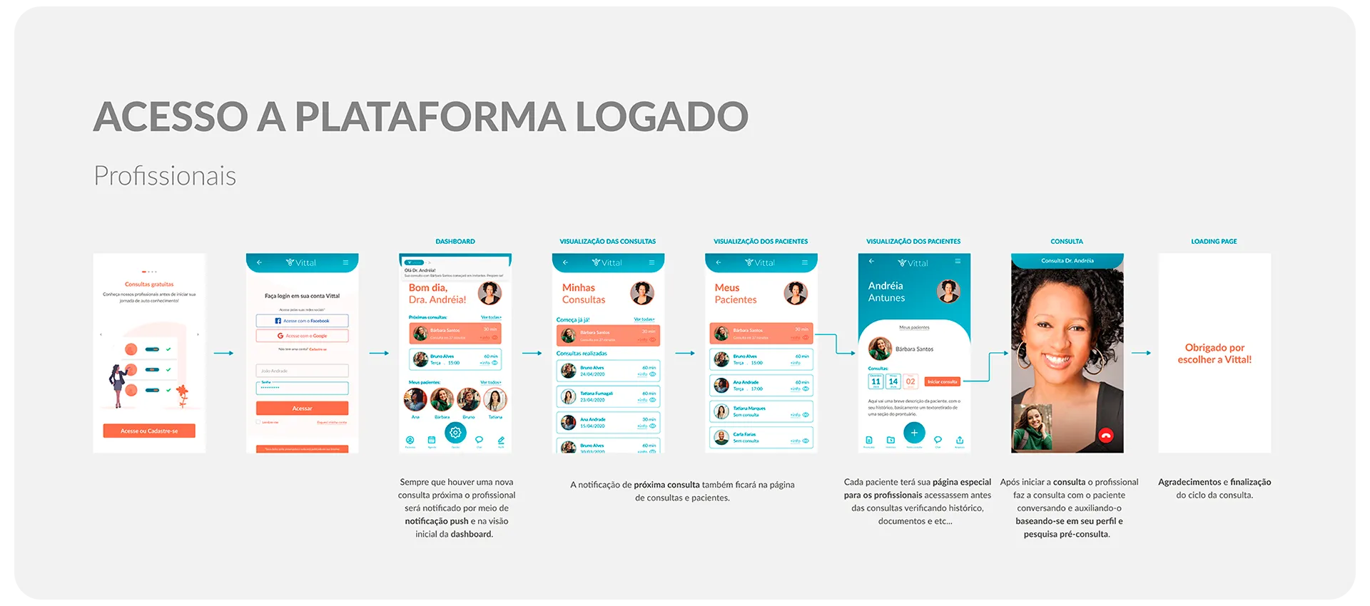
Every day Renata sees patients at a psychology clinic. One day, due to the COVID pandemic, she started seeing patients online. Before the pandemic, she only used her phone for regular communication, but with the pandemic, the clinic announced that all appointments must be conducted from home, respecting social distancing measures. Because Renata loves what she does and doesn’t want her patients to give up on their appointments, she looked for easier ways to conduct online sessions. That’s why she became increasingly focused on finding an app that could help her manage her appointments and promote her services to attract new clients.
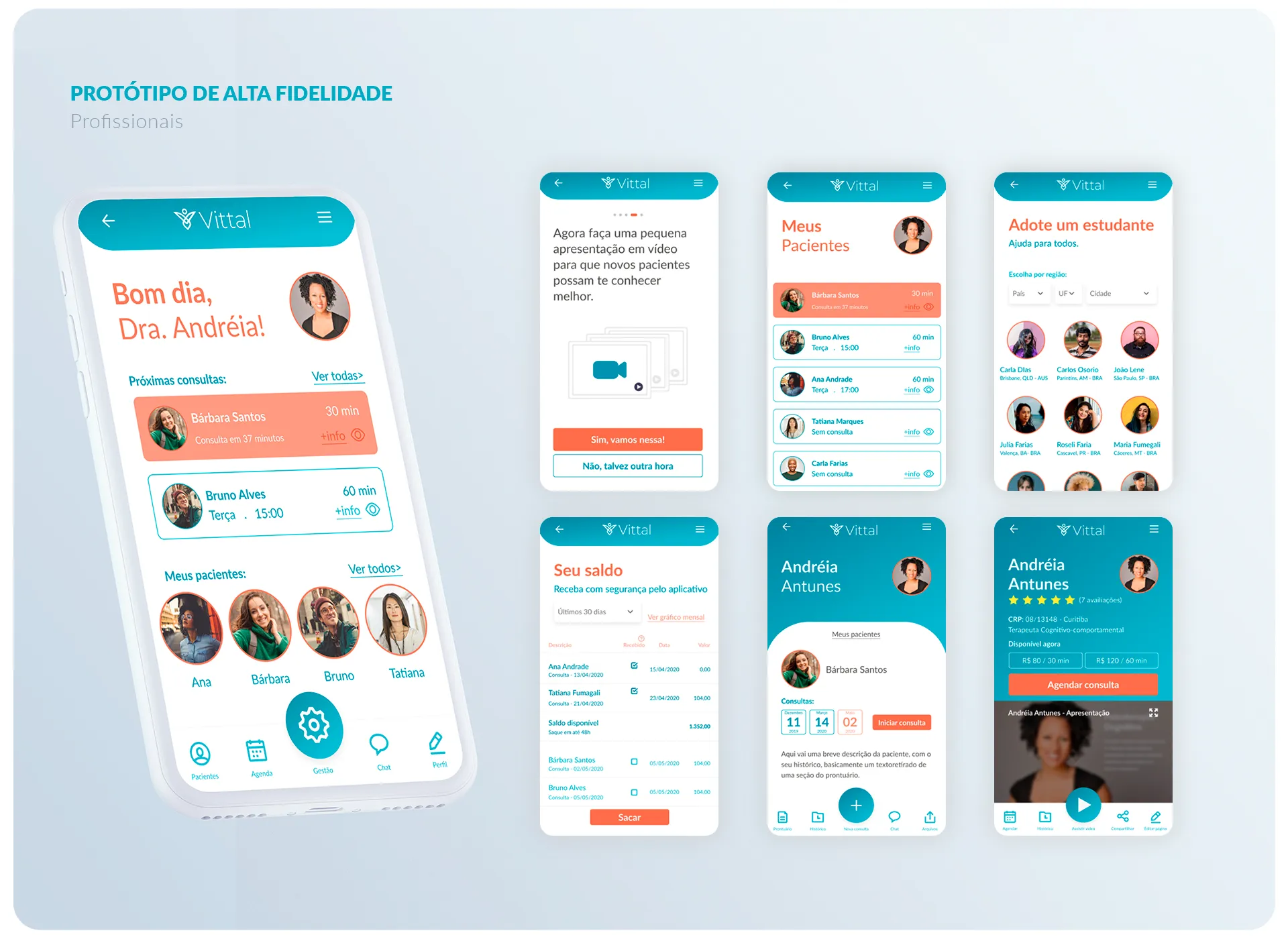
She found an app that not only allowed her to communicate with her patients but also enabled them to pay for her services in real-time. The app also allows her to manage her business and promote her personal brand, all on the same platform. This allows her to be 100% focused on what matters most to her: her patients.
Finally, Renata is gaining new patients, managing her business more efficiently, and providing better care to her patients.
To help define our users quickly and simply, we present below the story of each of them, based on the Pixar Storytelling technique.
The Research
Qualitative Research
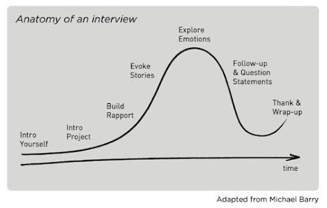
To conduct qualitative research, we adopted the interview anatomy model, as shown below.
This guide helped us explore stories based on past and real experiences, allowing the interviewee to relive those experiences and thus connect more deeply with us. That is, to feel what our user was feeling and achieve deeper empathy.
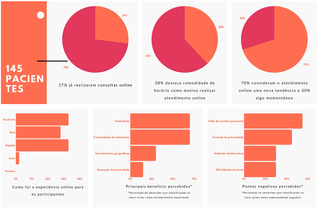
Quantitative Analysis
In addition to the above data, we identified that among the difficulties with online consultations, only technical issues (such as equipment quality or internet connection) and patients having difficulty with the technology are the most concerning. We discovered that other situations that are not problematic for professionals include scheduling, personal difficulty with the tools, and staying focused. On the other hand, the biggest challenges and concerns with remote consultations are the lack of privacy and building a relationship with new patients. Many agree that remote consultations do not replace in-person ones (62%), but they understand that it is very important (40%).
In addition to the data above, it is worth noting that among patients who do not have online consultations, 43% did not receive this proposal from the professional and 23% were unaware of online services. Of these patients, 31% are not interested in online consultations, while 69% are interested.
The Reframed Challenge
Initially, our group was presented with an initial challenge hypothesis that suggested leveraging telemedicine opportunities to improve the mental health of Brazilians in need, breaking down any geographical barriers. In this section of the article, we will explain the evolution of this challenge.
Treatment of information and definition of challenge
After conducting the research, we processed all the information, which allowed us to validate items from our CSD matrix.
For example, when we stated that “Patients do not feel comfortable in front of the camera,” we discovered that not only do most patients not mind, but in many cases, they actually feel more comfortable, protected, and less vulnerable.
Based on this, we adjusted and validated our personas – already presented in the Users section – generated insights for each of them, and constructed the challenges presented below:
How might we assist international students in caring for their mental health without them feeling the distance from their homes?
How might we support the management and growth of the business, allowing the psychologist to focus on what really matters: the psychological care of patients?
Evaluation Matrix
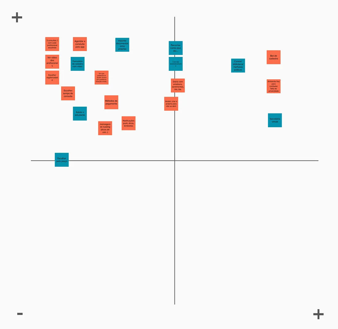
To prioritize our ideas, we utilized an evaluation matrix that considered the impact and effort required for implementation as our primary drivers. This helped us identify the most promising ideas to move forward with.
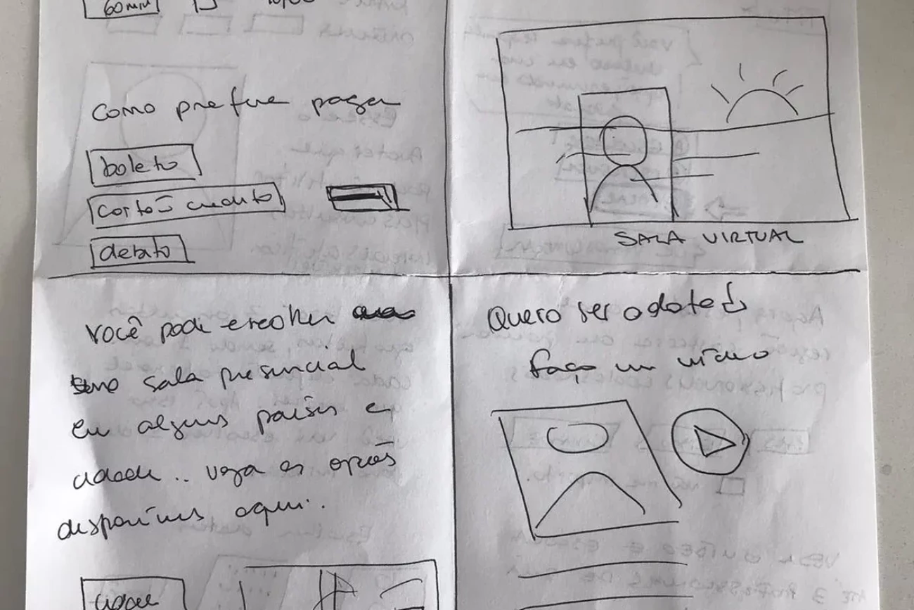
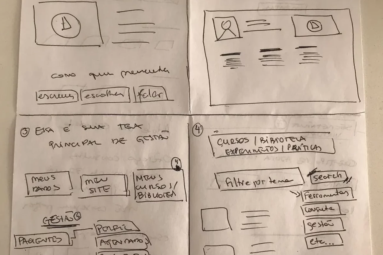
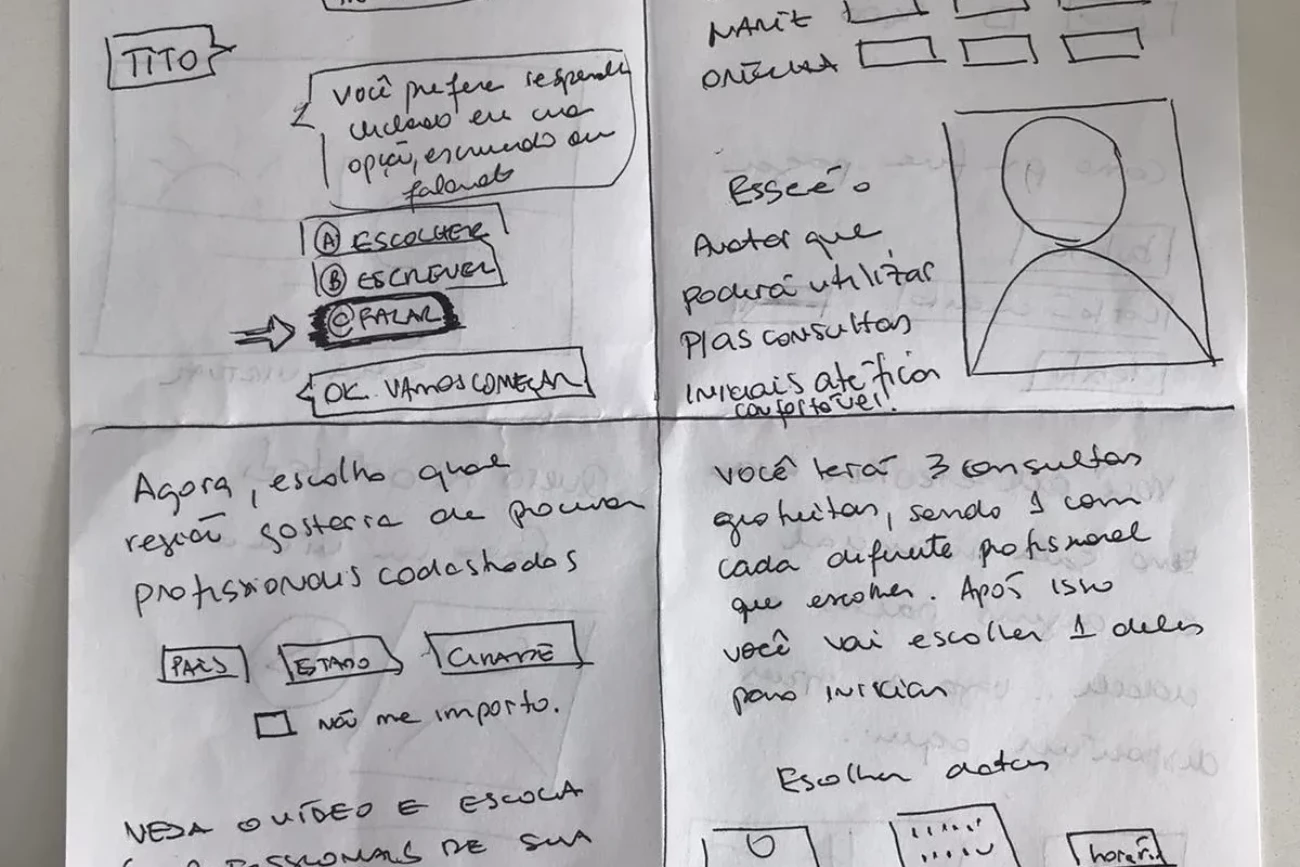
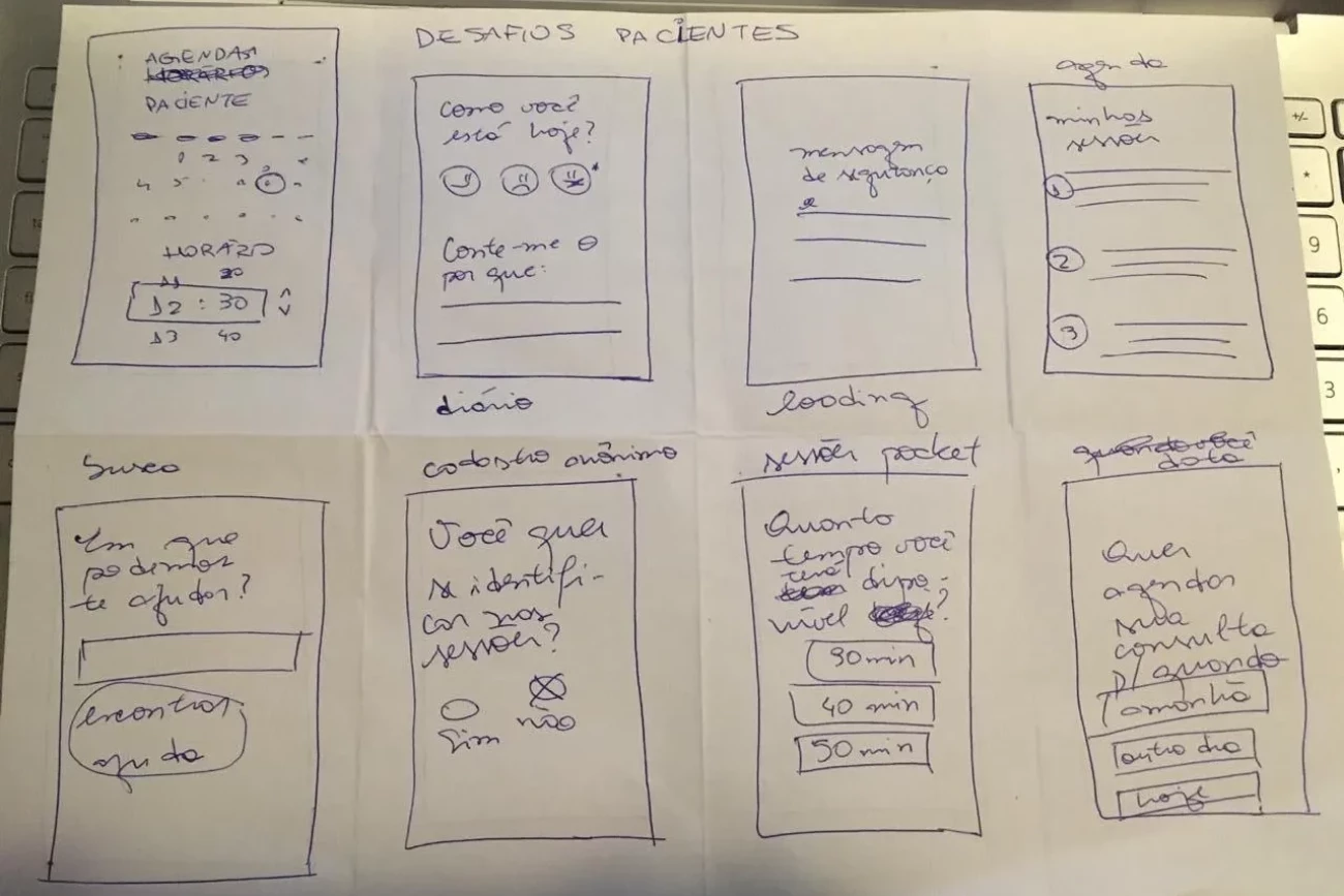
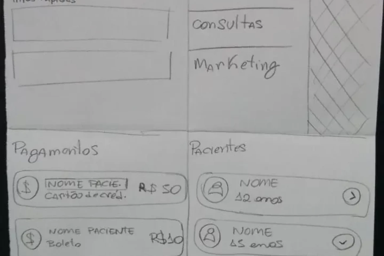
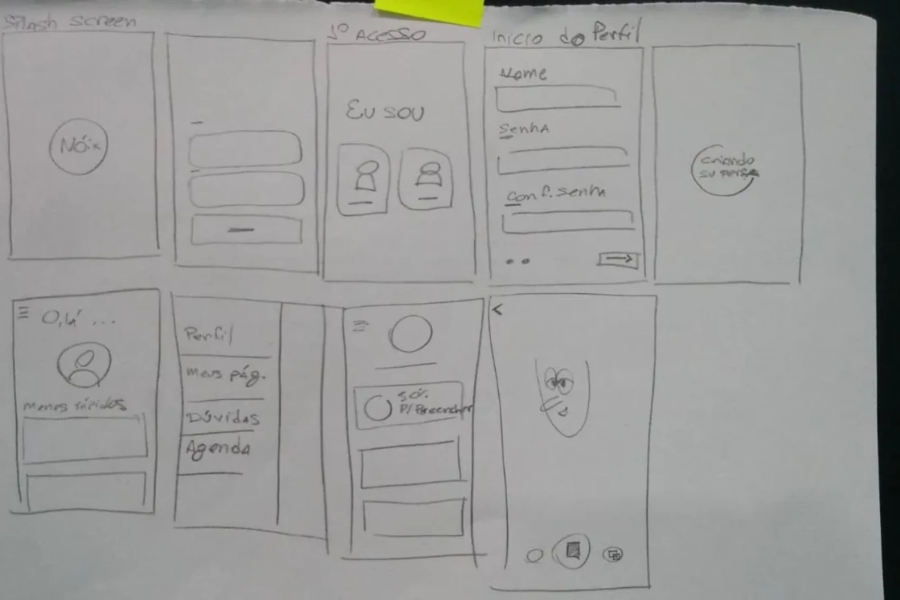
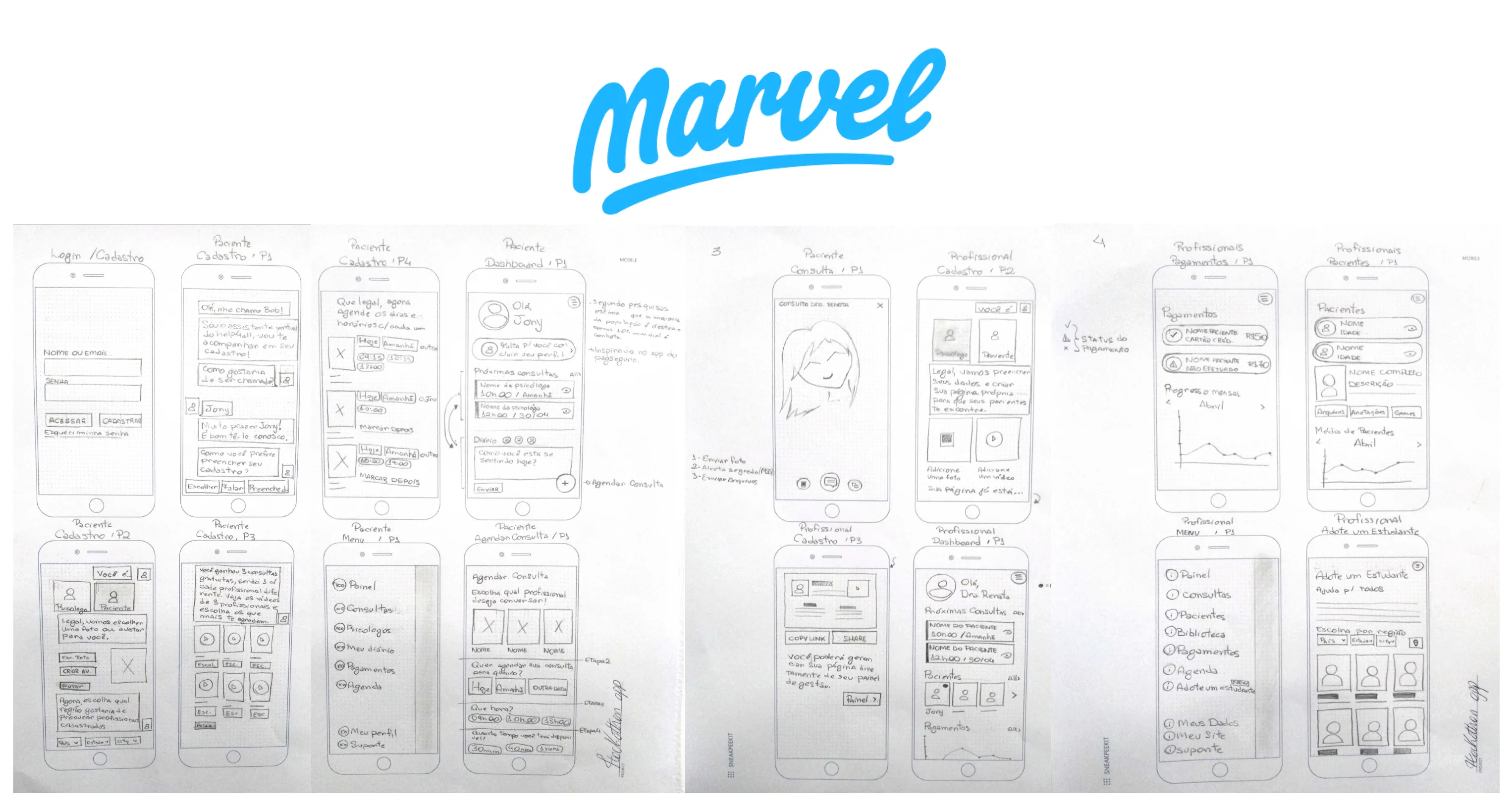
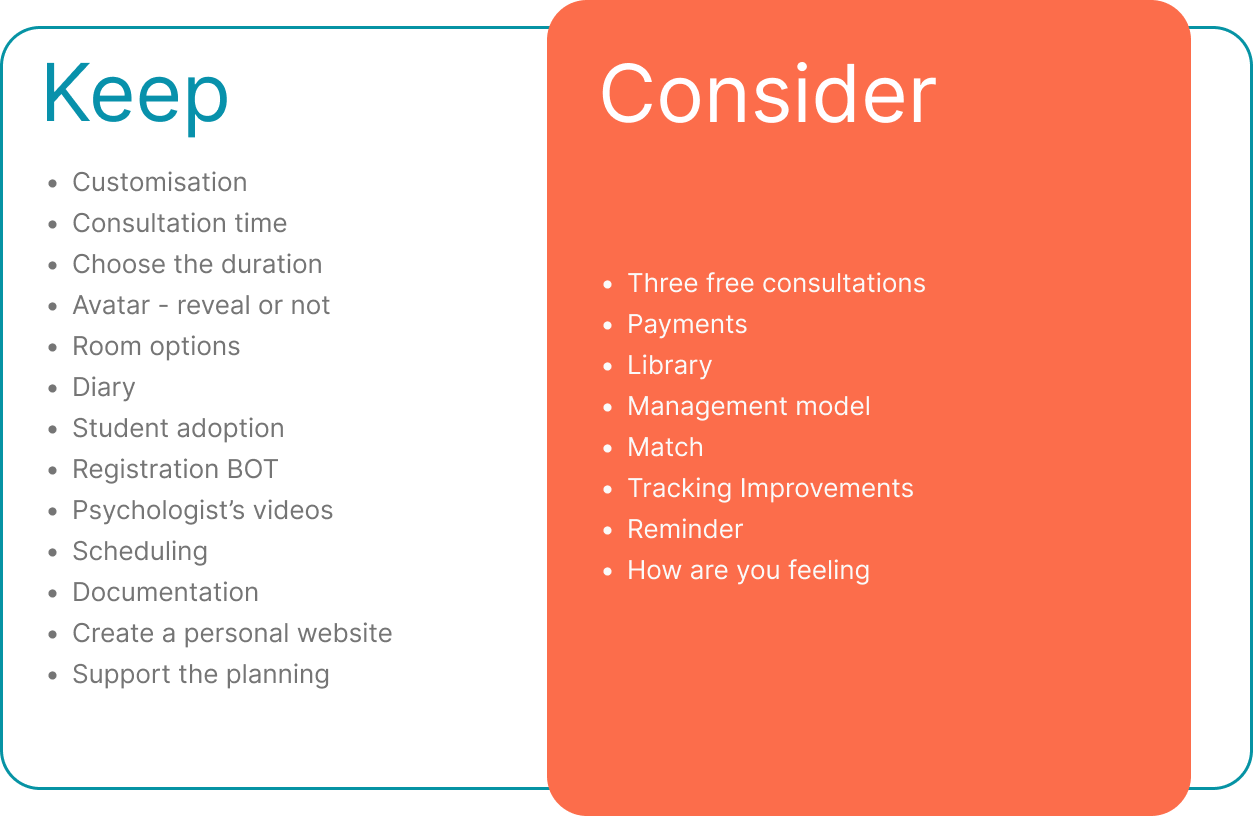
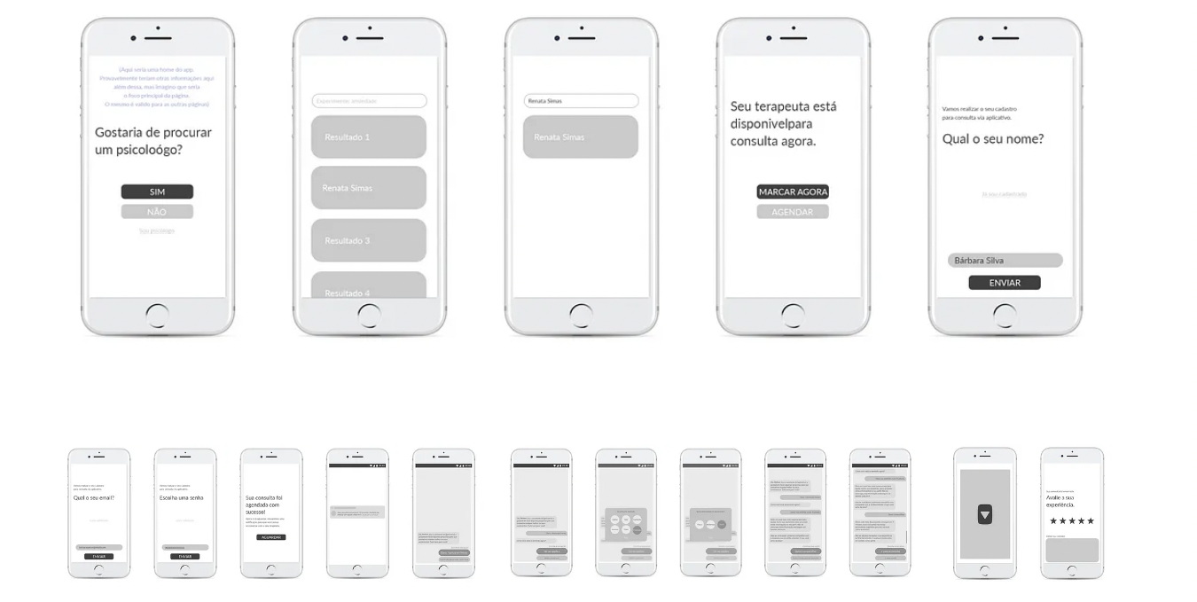
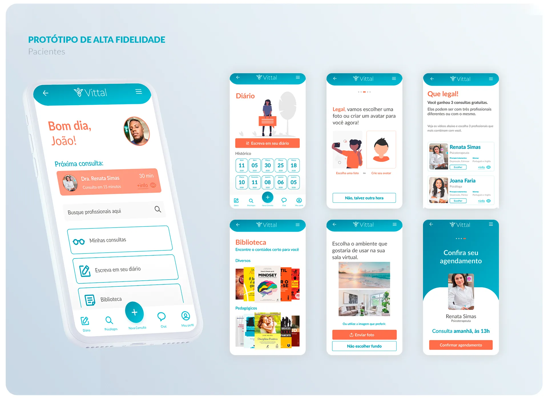
The prioritized ideas were grouped into categories: patients, psychologists, and the connection between them. These categories were then used to define the features that would be included in our first low-fidelity prototype.
Style Guide
Color Palette
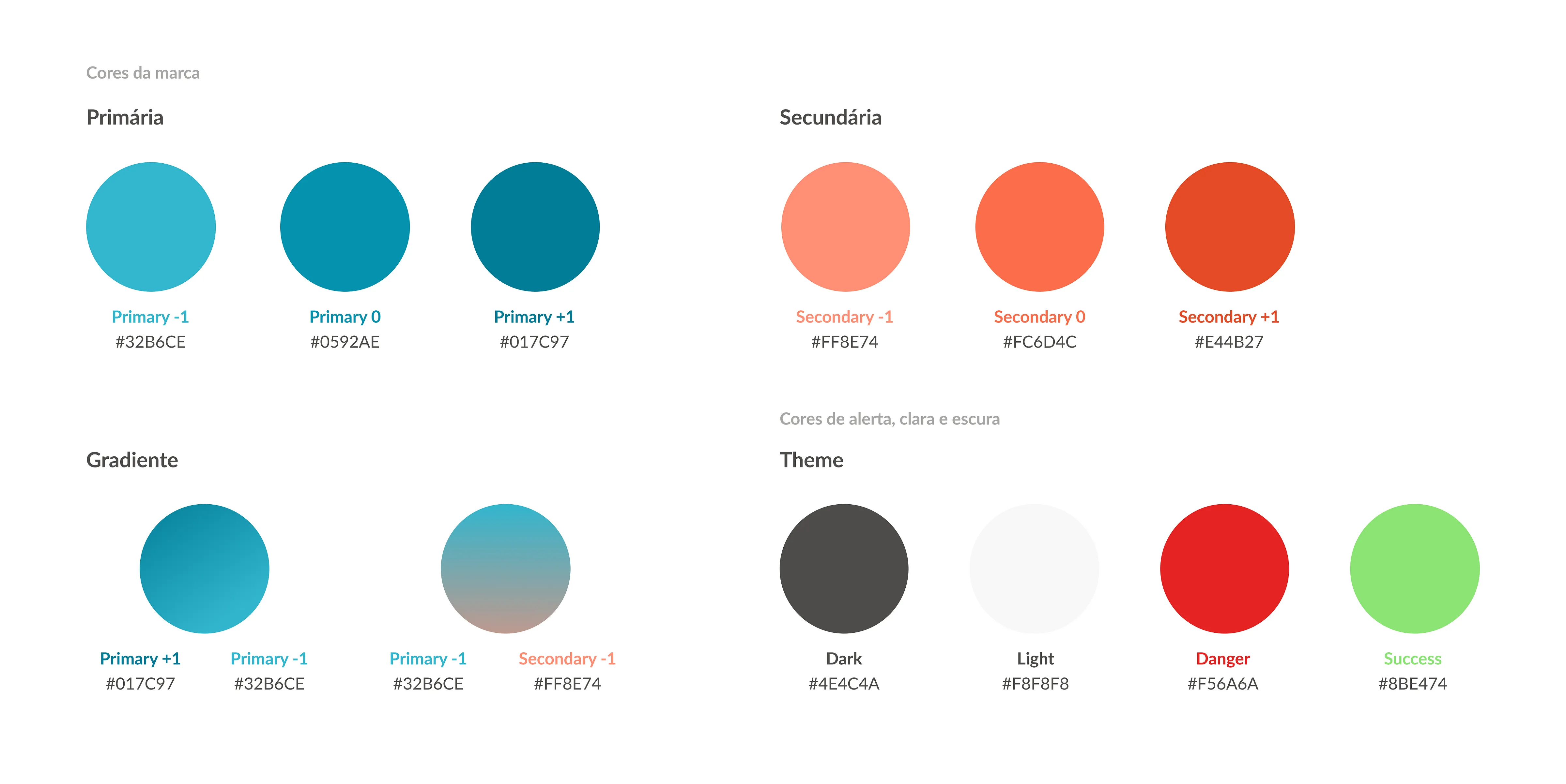
We selected high-impact and contrasting colours: blue and orange. We defined warm and cool tones, created differentiation elements, and established levels and hierarchies for buttons and texts. Additionally, we chose alert and success colours inspired by Bootstrap and opted for an open-source web framework for interface components, websites, and applications.
Typography
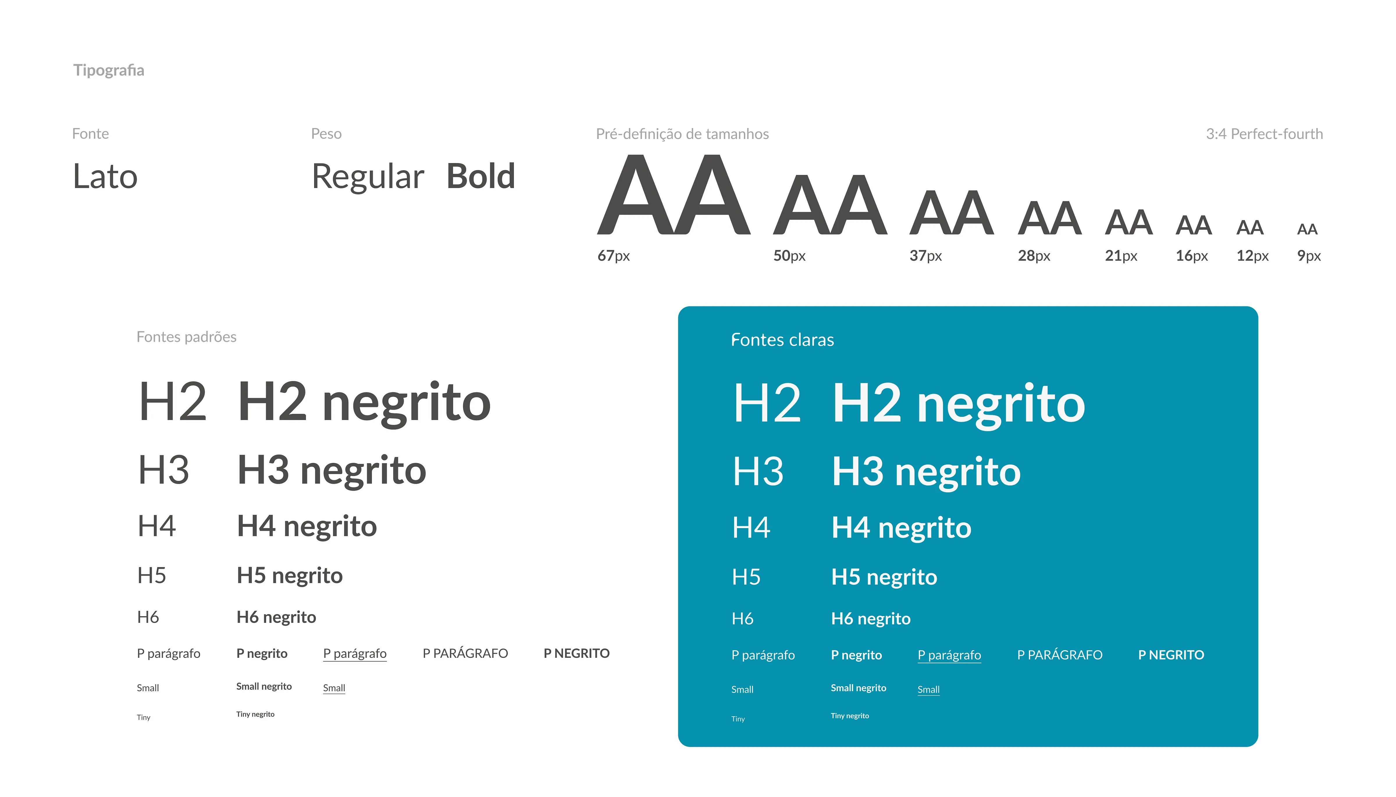
We chose Lato by Łukasz Dziedzic as the font, conveying modernity and being more objective and minimalist. Choosing a sans-serif font is important to promote character resizing without any distortion or illegibility. We also used the perfect fourth proportions to ensure balance and sobriety between the texts.
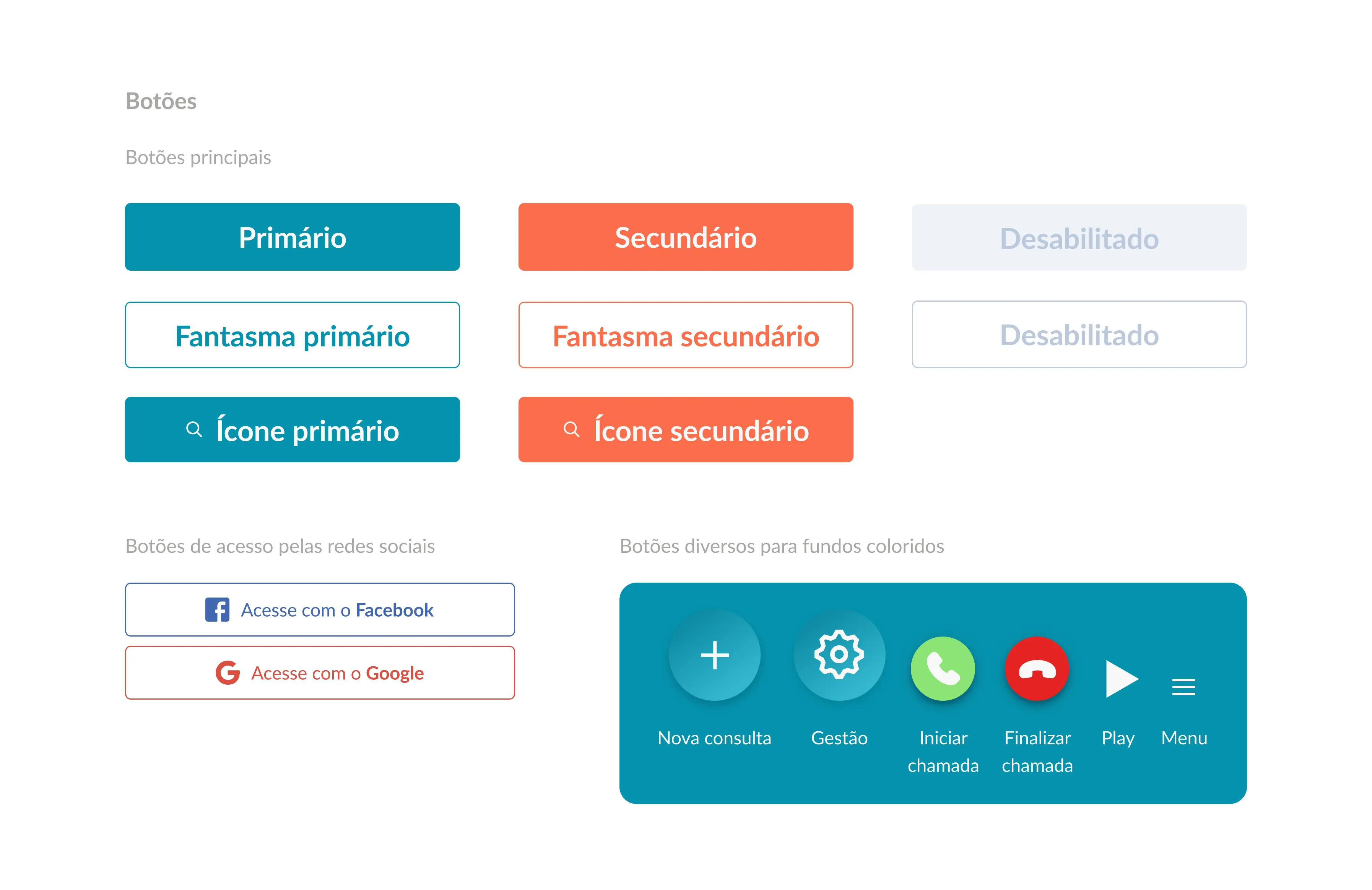
Buttons
For this theme, we used the main colors from the initially defined color palette. Two styles of buttons were used, solid and ghost, creating a hierarchy between elements when presented together. Border radius was also used to convey lightness, modernity, and create a more pleasing layout.
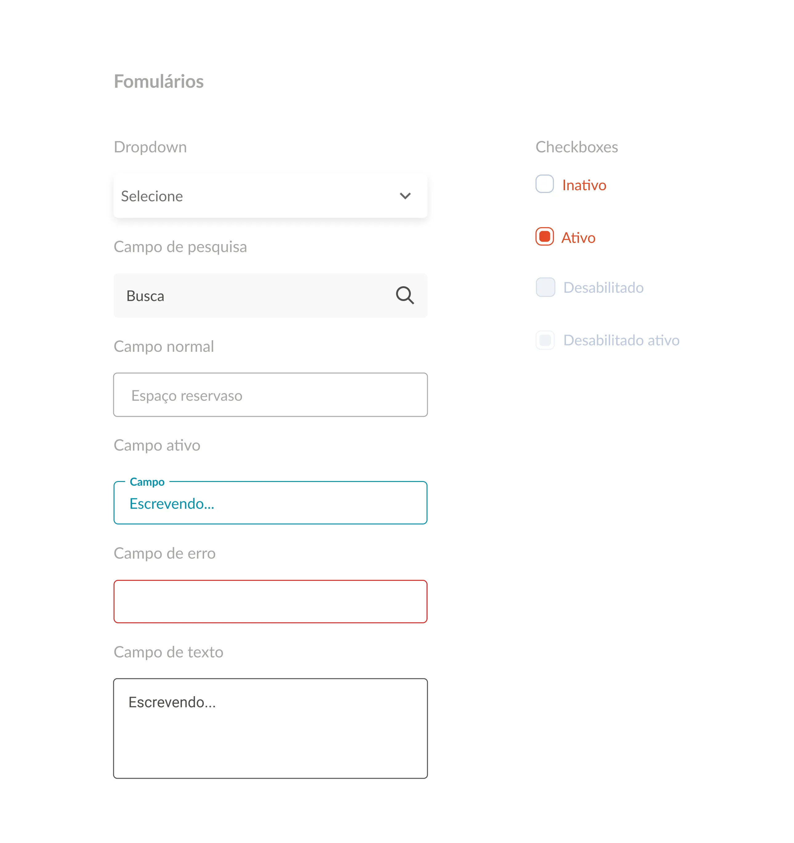
Forms and Search Fields
Like the buttons, text fields followed the same styles and used alert colors to indicate possible errors and successes, keeping the user informed of what is happening.
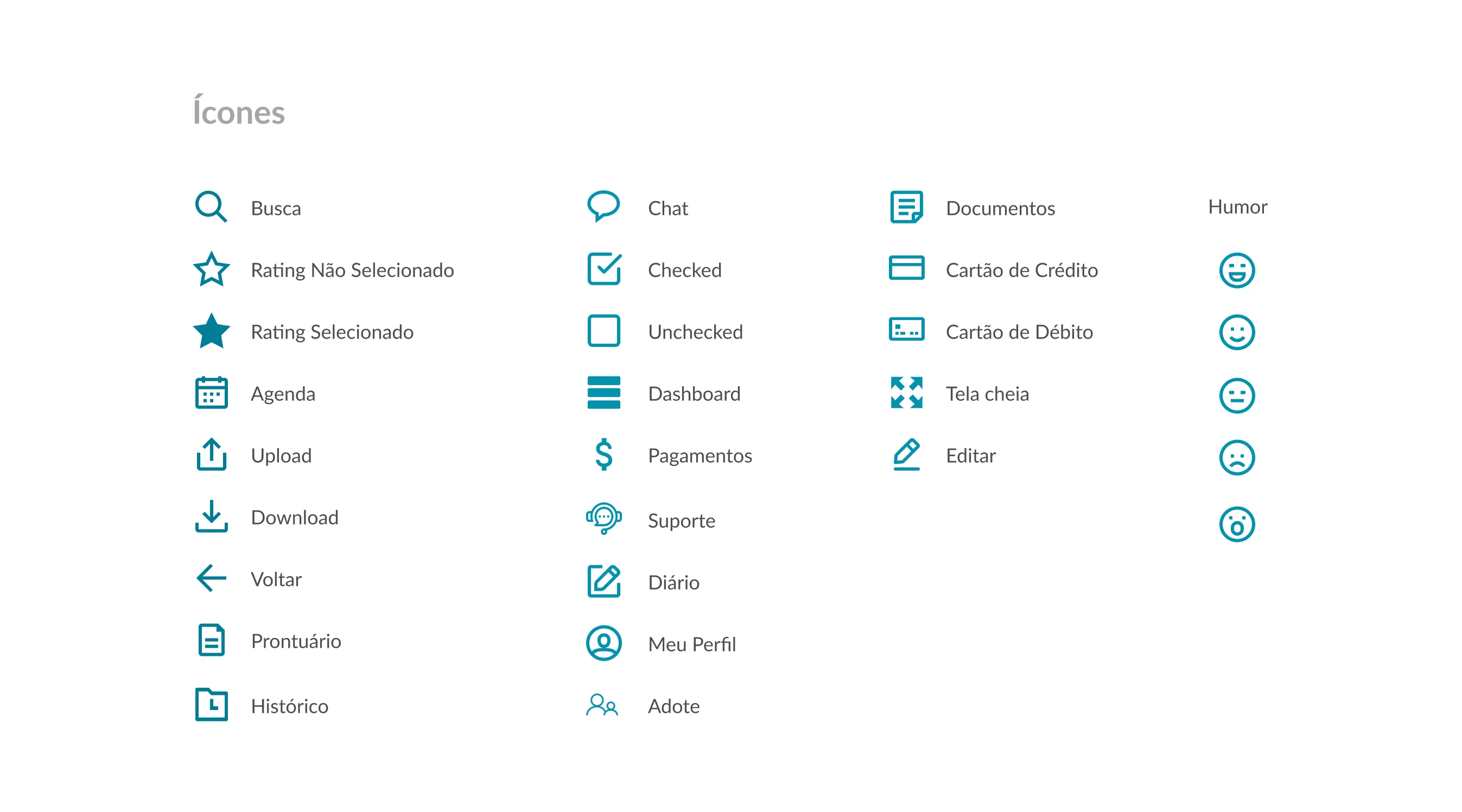
Icons
Accessibility and icons are strong allies when it comes to users with mental disabilities and other reading difficulties. They convey credibility, accessibility, and a more modern layout. If you want to read more about the importance of icons in UI design, check out the opinion of Mauro Pinheiro, assistant professor in the Department of Industrial Design at the Federal University of Espírito Santo (UFES).
The Usability Testing
User and Business Metrics
To measure the success of our solution, we created the following metrics:
- The number of people who were able to schedule a consultation with the help of the bot.
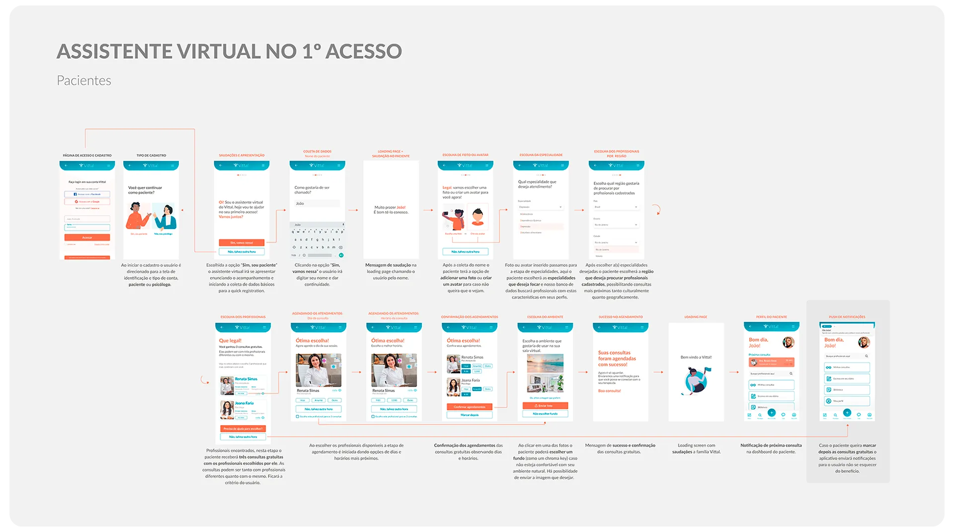
- Simplicity: People needed to register, apply desired filters such as country, state, and city, symptoms they have been experiencing, psychologist profile, choose three psychologists and schedule appointments with them (choosing dates and times). All of this in less than 5 minutes.
- We adapted and used the HEART framework to test our solution, considering:
- Happiness: User’s happiness while testing our prototype.
- Engagement: How much they engaged through questions that went beyond the proposed test.
- Adoption: The real interest of users in the product launch.
- Retention: The feeling of whether this would be a product to solve a specific problem or incorporated into the user’s life.
- Task Success: Ability to complete the task mentioned in item 2 above.
Prototype Testing
Fourteen tests were conducted up to the writing of this article. For the test, we sent the link to our prototype in Figma to people and presented a context, indicating the task they needed to perform without any interference from us.
Appointment Flow
- Everyone had an easy time executing the main task, scheduling through the bot within the established time.
- The background choice was great. “I loved it, loved it” is what one of the users said. However, some people did not understand this functionality because they had never used tools like Zoom, which has this feature.
- A clearer and more captivating intro was perceived as an improvement.
- The choice of three psychologists raised doubts about why three, and they did not understand that this referred to the three free consultations. Insert an option to use one, two, or three psychologists as well.
- Do not set a time for automatic messages. Let the user close it after reading.
Navigation From The Patient Menu
- Figma: They had some difficulty in performing the action they should have in the prototype. There were buttons that had no functionality (only layout), and this hindered navigation. We need to make the goal and limitations of the prototype clearer and perhaps focus on a single task.
- The forward or back arrows were not consistent with the flow that often occurred by scrolling. Users tried to scroll, drag the screen, and click on the arrows, but without success.
- The remainder of the consultation was not noticed by some users. We need to draw more attention to this.
- The bottom menu disappeared at times.
- In some cases, the information needs to be more repetitive when they decide to schedule a new consultation after the first experience (consider using the bot as a recurring scheduling option).
- Some users did not understand the difference between the Psychologists and My Appointments buttons.
- On the psychologists search screen, do not display psychologists before applying the filter.
- Automatic messages for filling out the diary (individually or with the help of the bot) were viewed positively and empathetically, and some users felt encouraged to respond.
- Diary: Two access options were leading to different screens.
- My appointments: also include previous consultations and not just future ones.
Conclusion and Learnings
After two weeks of the project, we achieved a surprising result and gained deep knowledge about the market, the problem, the users, and the solution. However, we understand that we have not finished here. We need to improve usability, have a clearer definition of what our MVP (Minimum Viable Product) is, go through some more iteration sprints, and look at basic business plan issues that go beyond a design project, such as financial analysis, pricing strategy, and business model, technological platform development, marketing planning, among others.
As of the completion of this article, we held some meetings with market people interested in moving forward with the solution.

